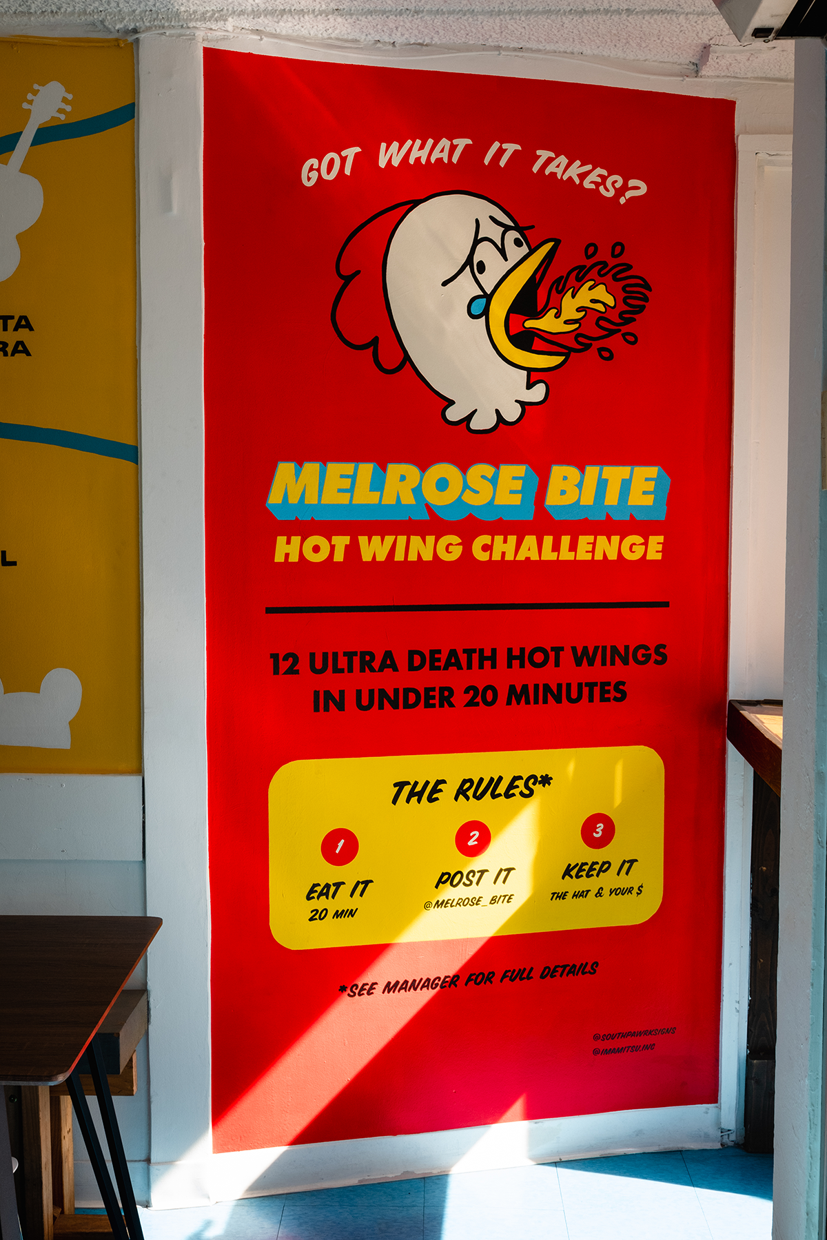
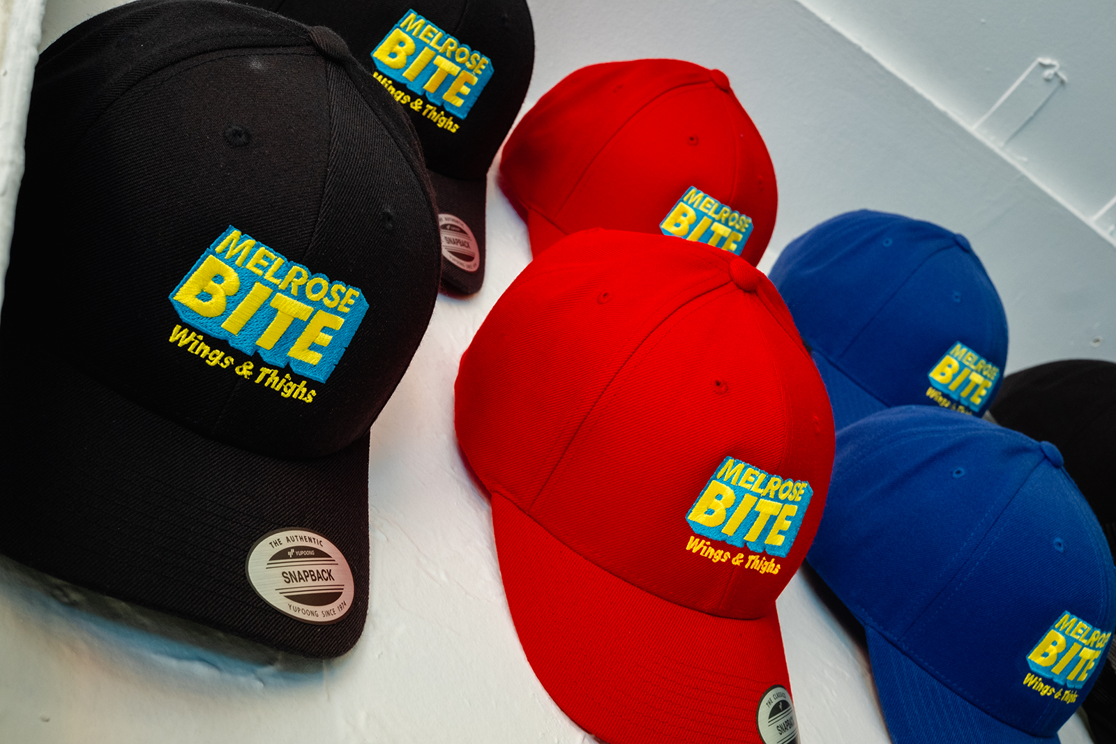
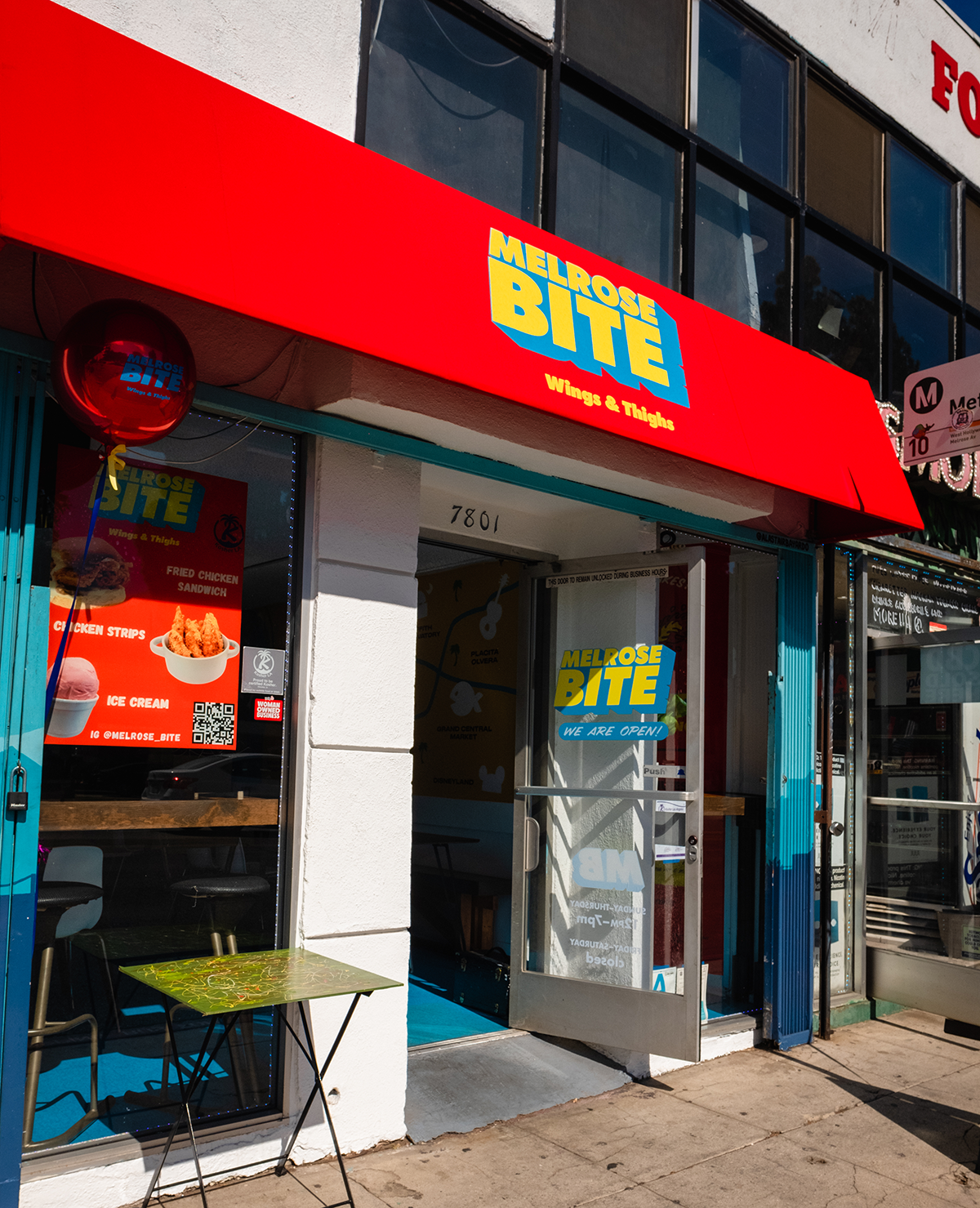
Melrose Bite has been on the block for awhile, the team decided to refresh the menu and the restaurant. I partnered up with and South Pawrk Signs working closely with the client to deliver a completely new identity for the restaurant. From there, our team applied this new look to signs, digital and print menus, window clings and so on.
EXPLORATIONS
We needed something that would appeal to the fashionable youth culture of Melrose Avenue. The client did not have any specific ideas, but we quickly agreed on something timeless and typographic.
We went with Futura Bold in an all caps lockup because it felt impactful and modern. Other explorations felt a bit too kitschy, but our final design felt like it would complement the all the high end sneaker shops in the neighborhood, yet feel inviting to the students across the street at Fairfax High School.


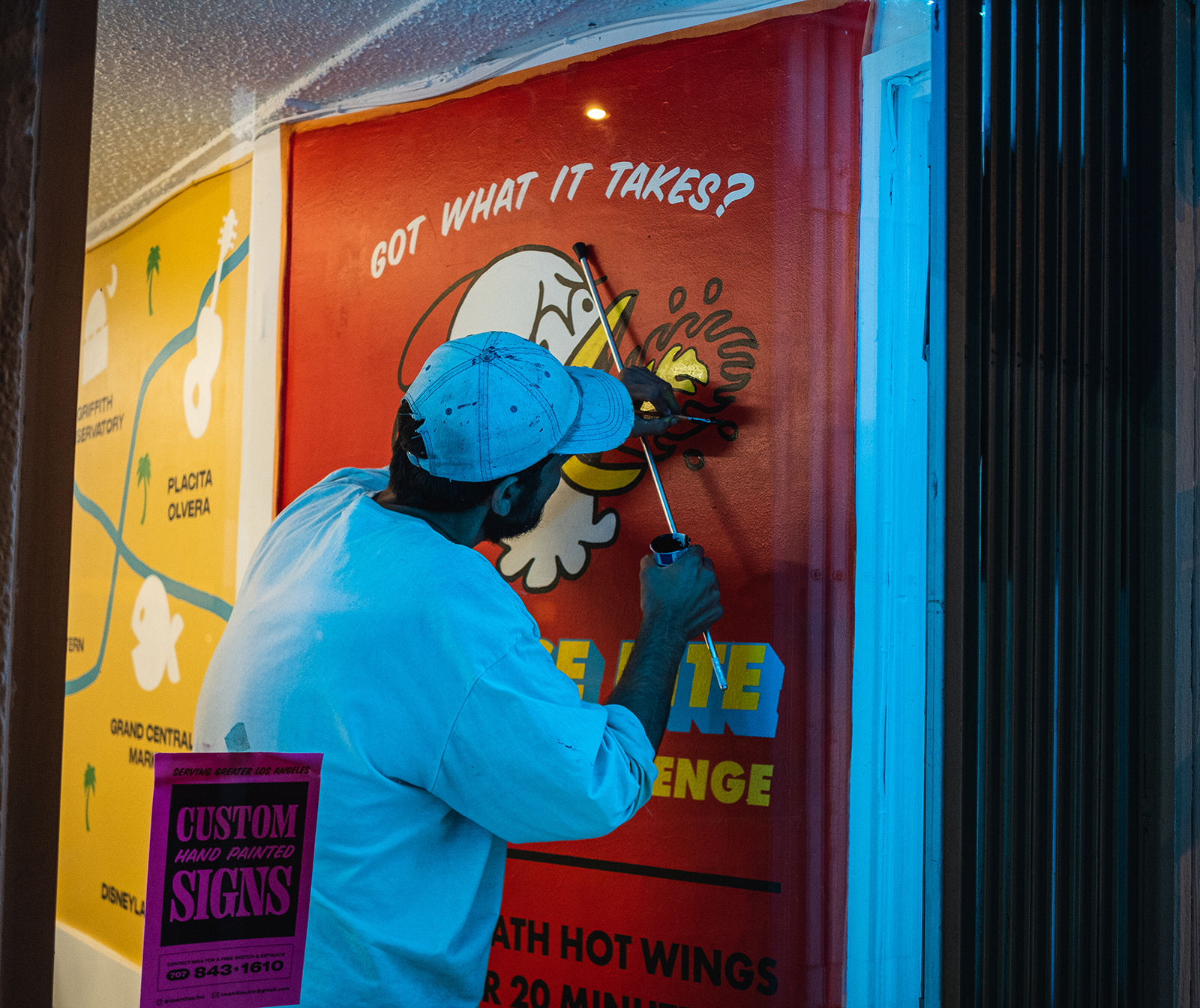
In addition to the branding, Wilmer and I designed and painted a 13' long mural for the restaurant. I wanted to create something that was visually interesting but also functional. The mural that sparks conversations between native-Angeleno employees and out-of-town customers.
The map became a visual aid for folks to discuss Los Angeles, without having to interrupt their dining experience and look at a phone. Each landmark was hand-selected by the owners and are some of their favorite places to take visitors.
Role: Art Director/Designer/Muralist/Sign Painter
Creative collaboration with Wilmer Reyes.
Hot Wing Challenge chicken illustration developed with Steve Medrano.
All signs and murals hand painted by Nina Hazen and Wilmer Reyes.
Creative collaboration with Wilmer Reyes.
Hot Wing Challenge chicken illustration developed with Steve Medrano.
All signs and murals hand painted by Nina Hazen and Wilmer Reyes.
